
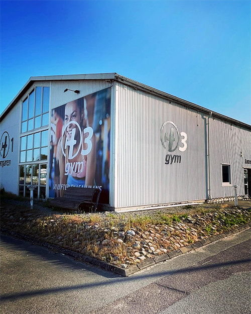
Hangaren
Assignment: Create a visual identity for Hangaren, a gym in Ystad. When it first started in 2000, the business was located in a large industrial building that resembled a hangar, which inspired the name.
Challenge: The design was intended to reflect the gym's open and inclusive atmosphere, and to signal energy and movement. When the business later expanded to three locations and changed its name to H3 Gym, the identity was updated to fit the new structure.
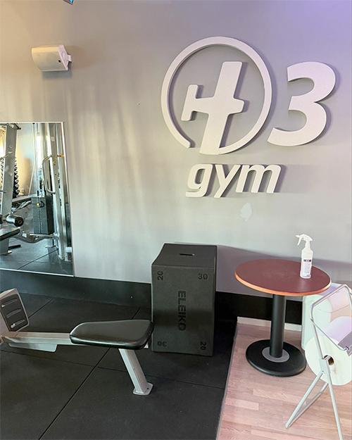
Solution: The original logo had a stylized “H” shaped like an airplane, framed in a circle to create a balanced whole. The blue color was chosen to convey freshness, purity and movement. When the gym became H3 Gym, the symbol was retained but adapted to the client’s wishes. In addition to the visual identity, we created signage, business cards, advertisements and profile material.
Results
The visual identity for Hangaren and later H3 Gym strengthened the gym's brand and demonstrated its development. The property illustration served as a strategic tool to communicate expansion opportunities and attract partners.


Read more about H3 Gym: h3gym.se