MinaApotek

Assignment:  Design a visual identity for MinaApotek, a proposed online service where pharmacies could offer products with special discounts. Create logos for the specialist pharmacies and mock-ups for websites.

Challenge:  The design would balance the individual identity of each specialist pharmacy with a visual connection to the parent company. Each service would be perceived as a standalone brand while also signaling shared ownership and quality assurance.

Solution:  The logo for MinaApotek was developed in the same style as Medicinpriser, and the specialist pharmacies were given their own logos with a uniform shape but distinct colors. Website design and communication materials were developed to visualize the concept and attract investors.

Results

Despite a well-designed design and clear branding strategy, the project was never completed, likely due to difficulties in finding investors. However, the work demonstrated the potential in creating a clear and cohesive brand structure for pharmacy services.

How MinaApotek works

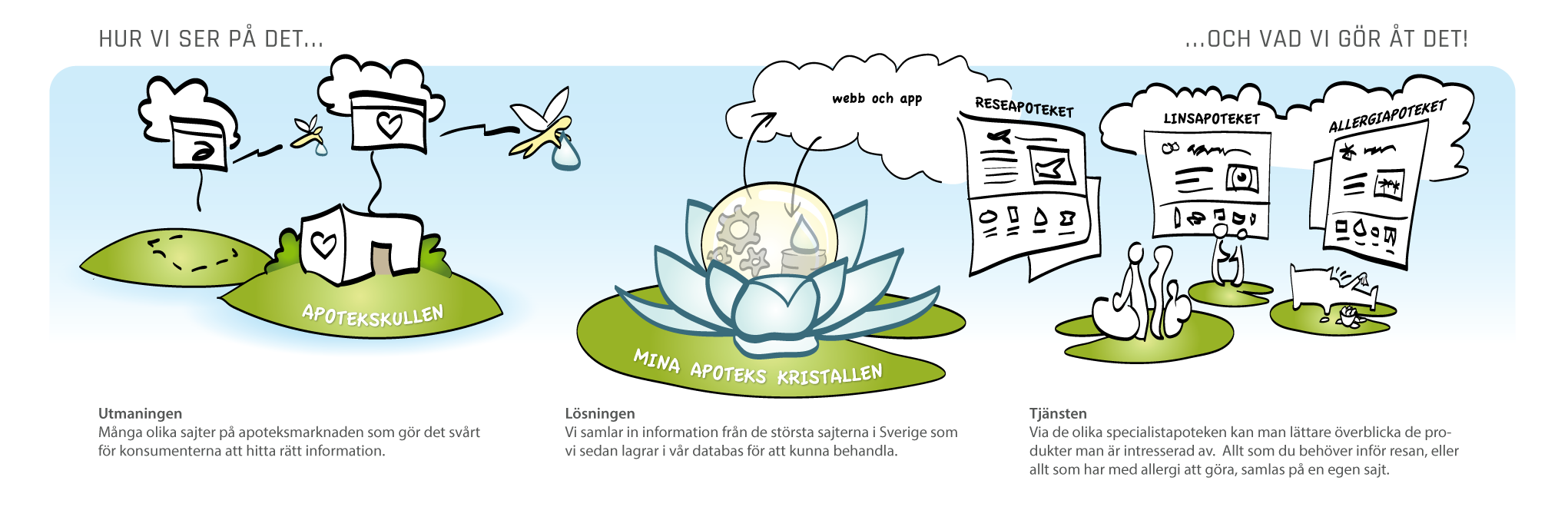
Metaphor: To clarify the service’s function and value for investors, we created this metaphorical illustration. The fairies represent data collection – they retrieve dewdrops of information about medicines and health products from pharmacy websites and bring it back to the water lily, where everything is processed and structured. The large dewdrop symbolizes the database, and the cloud shows how the information is made available via the web and app. On the water lily leaves we see the users, who easily find tailor-made pharmacy services for their needs, whether it’s travel, contact lenses or allergy medicine. (click on the image to enlarge)